|
Messages 1 - 45 of 97
First | Prev. | 1 2 3 | Next | Last |
Redcap
 |
||||||||
| Posted: December 27, 2008 9:59 am | ||||||||
|
Redcap
|
I really like this one. Maybe include transparent background so people can make web buttons ect. Also oditty occurs when you do perfect white vs. black, the black dot is light blue?
|
|||||||
| Posted: December 27, 2008 10:00 am | ||||||||
ronviers
 |
Thank you Redcap.
@ronviers |
|||||||
| Posted: December 27, 2008 12:43 pm | ||||||||
|
ronviers
|
I should be working but the dots were driving me crazy. I added the knockout and there is a new look for the dots. They blend differently and better maintain their respective colors.
 @ronviers |
|||||||
| Posted: December 27, 2008 1:54 pm | ||||||||
|
ronviers
|
Here is the old lead
 @ronviers |
|||||||
| Posted: December 27, 2008 2:01 pm | ||||||||
|
ronviers
|
And here is the new lead
 @ronviers |
|||||||
| Posted: December 27, 2008 2:02 pm | ||||||||
|
ronviers
|
Now I kind of like the old one better.
@ronviers |
|||||||
| Posted: December 27, 2008 2:04 pm | ||||||||
|
ronviers
|
Ok, I have added the background removal button and made the centers a little better.
I don't know. Black and white seems to bring out all its imperfections. I know you know to check saturation under lighting and that is the only thing I could thing of. If you can reproduce it please post a sample and I will track it down. Thanks again for the suggestions. Here is the new lead for comparison.  @ronviers |
|||||||
| Posted: December 27, 2008 9:14 pm | ||||||||
|
ronviers
|
I also added a size control for the center dots. I like it where I have it but I noticed on the web that the size is all over the place - I don't want to be known as the dot nazi, so I decided to let people choose.
@ronviers |
|||||||
| Posted: December 27, 2008 9:17 pm | ||||||||
|
ronviers
|
I have submitted another version that should post on Monday. But since then I have made an ever newer won that should post on Tuesday. I think the new new one is much better then the new one. I added a new mode the uses a trick I learned from Richard Bartlett's beautiful SpaceGen filter. Here is a sample:
 @ronviers |
|||||||
| Posted: December 28, 2008 4:36 pm | ||||||||
|
ronviers
|
I have also found a prettier way to blend the dots. Here is the lead preset for comparison to the others.
 @ronviers |
|||||||
| Posted: December 28, 2008 4:37 pm | ||||||||
|
ronviers
|
The symbols that use the new colors are considerably slower but could be worth it for some people.
 @ronviers |
|||||||
| Posted: December 28, 2008 4:43 pm | ||||||||
KGtheway2B
 |
||||||||
| Posted: December 28, 2008 6:20 pm | ||||||||
|
ronviers
|
I spent countless hours trying every sphere snippet in the library. I spent more time you yours than anyone else's. I just could not get it to work out.

@ronviers |
|||||||
| Posted: December 28, 2008 6:53 pm | ||||||||
|
Carl
|
Oh Ron Ron Ron you just can't stop playing with your balls
|
|||||||
| Posted: December 29, 2008 12:03 am | ||||||||
|
KGtheway2B
|
I just took a look at the internals, if you don't mind keeping the size fixed you could just toss in the circular arc profile bit to use just for the height map.
Not a biggie though, it looks alright on its own. (But seriously, take a second to clean things up in there |
|||||||
| Posted: December 29, 2008 12:03 am | ||||||||
Betis
 |
I wouldn't have the line down the middle so thick and dark, There's not enough filter!
Roses are #FF0000
Violets are #0000FF All my base are belong to you. |
|||||||
| Posted: December 29, 2008 1:38 am | ||||||||
|
ronviers
|
Maybe eyes.
But I added nearly twenty presets - that's a lot of presets.
I unplugged most of the unused stuff in the newest one. I left one mul blend but it was balancing everything else. This filter is all about balance. @ronviers |
|||||||
| Posted: December 29, 2008 6:17 am | ||||||||
|
ronviers
|
The new new one is here! This one has been all cleaned up, lots of presets and new colors.
@ronviers |
|||||||
| Posted: December 29, 2008 9:02 am | ||||||||
|
ronviers
|
Thanks for taking a look. @ronviers |
|||||||
| Posted: December 29, 2008 9:05 am | ||||||||
|
ronviers
|
Be sure to delete the one that exists in your local library or you will not get the newest one.
 @ronviers |
|||||||
| Posted: December 29, 2008 9:22 am | ||||||||
|
Betis
|
Oh, by "not enough filter," I meant not enough of the important part, which is the yin and yang.
Roses are #FF0000
Violets are #0000FF All my base are belong to you. |
|||||||
| Posted: December 29, 2008 11:03 am | ||||||||
|
ronviers
|
This is the first texture I have developed on my new monitor – I may have it set too bright. Here is one I brightened up for ahimsa. Does it look better on your system?
 @ronviers |
|||||||
| Posted: December 29, 2008 12:37 pm | ||||||||
|
ronviers
|
To me it is just too bright but if I drag it to my crt it looks ok - not great but ok.
@ronviers |
|||||||
| Posted: December 29, 2008 12:38 pm | ||||||||
|
Betis
|
There are white splotches where you should set the contrast down so it doesn't wash out. And it is bright compared to your other presets for this filter.
Roses are #FF0000
Violets are #0000FF All my base are belong to you. |
|||||||
| Posted: December 29, 2008 12:42 pm | ||||||||
|
ronviers
|
Here is one where I drove the saturation up in Lab and hit it with some gamma. It advantage to this version it that it has a brightness control so users can choose.
 @ronviers |
|||||||
| Posted: December 29, 2008 12:55 pm | ||||||||
|
ronviers
|
I needed to do an update anyway because when I mentioned you and Richard in the description I screwed up the links. I guess I cannot use links in the descriptions.

Here is the same as before but brightened without messing up the saturation.  @ronviers |
|||||||
| Posted: December 29, 2008 1:06 pm | ||||||||
|
ronviers
|
Ok, I have submitted it with a brightness control. Now the users can decide just how much yin and yang is right for them.
Thanks Betis @ronviers |
|||||||
| Posted: December 29, 2008 1:33 pm | ||||||||
|
Betis
|
Roses are #FF0000
Violets are #0000FF All my base are belong to you. |
|||||||
| Posted: December 29, 2008 1:47 pm | ||||||||
|
ronviers
|
The new new new one is here!
@ronviers |
|||||||
| Posted: December 30, 2008 3:44 am | ||||||||
|
ronviers
|
@ronviers |
|||||||
| Posted: December 30, 2008 3:46 am | ||||||||
|
Kraellin
|
nice, ron
If wishes were horses... there'd be a whole lot of horse crap to clean up!
Craig |
|||||||
| Posted: December 30, 2008 8:51 am | ||||||||
|
ronviers
|
Thanks Craig.
Btw, I tried your sphere snippet, minus the fuzziness, and it came very close to working but I could not get it completely corrected. @ronviers |
|||||||
| Posted: December 30, 2008 7:42 pm | ||||||||
|
Betis
|
How does a sphere not work? Don't take that offensively, I'm actually curious.
Roses are #FF0000
Violets are #0000FF All my base are belong to you. |
|||||||
| Posted: December 30, 2008 9:50 pm | ||||||||
|
ronviers
|
To be honest, I don't know. This snippet shows the way I wanted it to work, which didn't, and the way I ended up using. I tried and tried to get it to work with the sphere but I just do not have the technical savvy.
sphTst.ffxml @ronviers |
|||||||
| Posted: December 30, 2008 10:04 pm | ||||||||
|
ronviers
|
The solution is probably going to look very simple but without really knowing what I'm doing, it was just a crapshoot.
@ronviers |
|||||||
| Posted: December 30, 2008 10:15 pm | ||||||||
|
ronviers
|
You can see from the bumps in this image that it is not correct.
 @ronviers |
|||||||
| Posted: December 30, 2008 10:24 pm | ||||||||
|
Betis
|
This might be a little better, I tailored it so that at least the Sphere curve works, although it doesn't get rid of those little... things, I think those are going to stay there no matter what, it's what the black line does.
Anyway, here is my "fixed" version of the one you posted, I hope it's aim for the direction you were. I also added a slider that lets you make the circle any size (from 50% to 100%). sphTst_fixbetis.ffxml Roses are #FF0000
Violets are #0000FF All my base are belong to you. |
|||||||
| Posted: December 30, 2008 11:38 pm | ||||||||
|
ronviers
|
Wow! That really cleaned it up!

I don't want to post any samples until I makes some aesthetic decisions regarding blend modes and colors. I also want to get rid of that shoddy brightness control and replace it something better. I think I can cut the render time in half with a little work. I will post an update as soon as I can. Thanks a lot. @ronviers |
|||||||
| Posted: December 31, 2008 12:22 am | ||||||||
|
Betis
|
Hehe, No problem. I hope that fixed what you were trying to fix.
Roses are #FF0000
Violets are #0000FF All my base are belong to you. |
|||||||
| Posted: December 31, 2008 2:03 am | ||||||||
|
ronviers
|
I submitted a new one but I was tired and I may have submitted and old one by mistake.
@ronviers |
|||||||
| Posted: December 31, 2008 5:52 am | ||||||||
|
Betis
|
Does that decrease the black line around each dot?
Roses are #FF0000
Violets are #0000FF All my base are belong to you. |
|||||||
| Posted: December 31, 2008 11:29 am | ||||||||
|
ronviers
|
I'm not at my computer but after lunch I will post it here because it looks like nothing posted. Wait until you see it, the dot blend that is, it's a masterpiece.
@ronviers |
|||||||
| Posted: December 31, 2008 11:54 am | ||||||||
|
ronviers
|
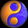
Usually I'm not able to get things to work exactly the way I plan, but in the case of the dot blend I got it just the way I wanted. The large dots with large falloff works well for the opal colored ones while the sharper falloff works better for the solid color ones.
I am very happy with the surface maps too. I think they give it a very nice look without overwhelming it with reflections. Like you mentioned, it's not perfect, and probably never will be by its nature, but I'm ok with how it turned out. In a way it's better that it is small because the opal colored ones take a long time to render and the users can always bump up the resolution if they are willing to wait or have a lot of horsepower. Thanks again, it would not be nearly as nice without your help. YinYang.ffxml @ronviers |
|||||||
| Posted: December 31, 2008 12:35 pm | ||||||||
|
Betis
|
Weird, Google Chrome won't let me post a comment, the page just ends at the last post...
Anyway, you are quite welcome. Roses are #FF0000
Violets are #0000FF All my base are belong to you. |
|||||||
| Posted: December 31, 2008 1:34 pm | ||||||||
Messages 1 - 45 of 97
First | Prev. | 1 2 3 | Next | Last
Join Our Community!
Filter Forge has a thriving, vibrant, knowledgeable user community. Feel free to join us and have fun!
33,825 Registered Users
+12 new in 30 days!
153,741 Posts
+13 new in 30 days!
15,384 Topics
+5 new in 30 days!
Online Users Last 5 minutes:
26 unregistered users.
Recent Forum Posts:
- Ancient Free Packs!! by Shayne
2 days ago - Double Mosaic by Ramlyn by Ramlyn
July 9, 2026 - New awesome TEXT component FF 14 - How to get the most of it? by CFandM
July 8, 2026 - Variable Kaleidoscope by inujima by SpaceRay
July 6, 2026 - Question about Upgrading to newest version by GMM
July 6, 2026 - Guide on how to use texture maps PBR export with Filter Forge for 3D by SpaceRay
June 24, 2026 - PBR work flow...? by SpaceRay
June 24, 2026 - Chaos Fields by Ramlyn
June 21, 2026 - Unleashing creativity art with the help of filter forge 11 by EAdams
June 14, 2026 - FF 11 and FF 12 Studio animations that could maybe be done I think by CFandM
June 8, 2026 - BB - BubbleBlocks by Ramlyn by Ramlyn
June 2, 2026 - Dragon Distort II by Wolfgang Halder by Wolfgang Halder
June 1, 2026