Skybase
 |
||||||
| Posted: October 24, 2014 10:30 pm | ||||||
|
Skybase
|
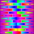
COLORFUL CHILDREN'S BOOK BACKGROUND THINGY.
maybe? So here's a fun question: as an author of this filter, how would you use it?  |
|||||
| Posted: October 24, 2014 10:32 pm | ||||||
DJI
 |
First of all i'm not an author of this filter,i'm thee author of this filter. And now here's a fun answer. I'd use it wherever I needed a bright playful image. What I want to know is why neither you nor anyone else has jumped all over 3D Reflective Smooth Techno Photo Effect?
"Art is quite useless." Oscar Wilde |
|||||
| Posted: October 25, 2014 12:05 am | ||||||
|
Skybase
|
Alright, it just caught my eye because it was super colorful. I get attracted to that.
Personally I thought I'd just modify it so instead of it being a rainbow, I just thought it might look nice with these schemes as well: http://www.colourlovers.com/palettes/...eta?page=2 Rainbows are technically some of the hardest gradient schemes to use in terms of design since white / black text or any color drowns in them. This is simply due to contrast.
Actually there's a thing with that. I did notice that filter and I was playing with it but I didn't have time to leave thoughts or examples around due to daily workloads. (I work at an extremely busy design firm so it kinda hinders me doing personal work.) It's also part because, unfortunately, the filter takes very long to render. At 600x600 it's taking 2 minutes with a relatively fast machine. The images I was feeding were 6000x4000 so it'd probably take about 30 ~ to an hour minutes depending on what I would be running at the time. I typically do work and sneak some FF matters behind. So there's that. I also think it just simply got buried amongst everything else you submitted. You did dominate the recent list haha. |
|||||
| Posted: October 25, 2014 2:45 am | ||||||
|
DJI
|
I'm not sure what's going on with your rendering times. This image was rendered @ 2732x1536 in under 3 minutes. ( I reduced it to 1366x768 to upload here.)
  "Art is quite useless." Oscar Wilde |
|||||
| Posted: October 25, 2014 3:06 am | ||||||
EAdams

Posts: 448 |
Hi DJI,
Please accept the following as constructive feedback and not criticism. Skybase has a very good point. If not for this discussion, I never would have looked past the first preset of this filter because of the impractical color scheme, and I would not have downloaded it. On further examination, I like some of the other presets much better than the default one, but the colors still clash. When I need a bright playful image I still want one that has a deliberate and pleasing color scheme. I am still not sure what this filter is trying to be. There are some nice patterns, but the forced rainbow aspect reduces the filter's usability for me as a pattern filter and rules it out to be used as a background. |
|||||
| Posted: October 25, 2014 4:26 am | ||||||
|
DJI
|
 "Art is quite useless." Oscar Wilde |
|||||
| Posted: October 25, 2014 5:01 am | ||||||
|
Skybase
|
So ok, I'll leave some ideas around.
One of the key elements of making filters for the open public is to make it as user-friendly and customizable as possible while keeping your ideas of design intact. So you basically just need to think about what other people really want from your filter. Surely "usage" is a matter of whoever finds it useful, but most people simply want to use a filter for their needs, and having the ability to customize it to their liking is what's likely to be appreciated. In the case with this filter, the key problem emerges: that the initial impression of the design is hyper rainbow and hyper vividness, and the shapes are generally fixed to it's appearance. So in terms of the filter, despite having several controls, it's actually not as flexible as it should be. This is the challenging part of FilterForge, and also the most rewarding part if you achieve it. To start the train of thought, here's what a google image search of "colorful scrapbook" reveals: https://www.google.co.jp/search?q=scra...+scrapbook Note the overall homey muted scheme of colors and the comfortable tone the images share. Also note the simple design and composition of each pattern. This overall constructs the idea that a scrapbook is a personal item and not something showy. While there are a few exceptions in the search, a good number of them present that feeling. Now honestly, I don't really know your process of making filters. So forgive me if I'm really just blabbing on about stuff you may have already considered. But the whole idea of constructing a filter is about constructing what you and everybody wants. I hope what I'm writing here kinda helps getting the idea flow going! If in any case the idea isn't as clear, I absolutely would love to help. In the end you are one of the most prolific uploaders to the public library. So I bump into your filters very often. |
|||||
| Posted: October 25, 2014 6:09 am | ||||||
|
Skybase
|
Heh... that last post came in just as you posted.
I see your ideas. I kinda imagined Lisa Frank. |
|||||
| Posted: October 25, 2014 6:36 am | ||||||
|
DJI
|
How's about this for muted colors?
 https://lunabludesign.wordpress.com/20...l-rainbow/ Or this? https://www.etsy.com/listing/187270810...ref=market Or this http://enlivendesigns.us/2014/04/brig...-download/ Or this? https://www.etsy.com/listing/118445023...ting-other Or this? http://jamiebrock.hubpages.com/hub/Fr...d-Patterns Or this? https://www.etsy.com/es/market/rainbow_paper Or this?https://www.etsy.com/listing/68802464/...book-photo Just to name a few. https://lunabludesign.wordpress.com/20...l-rainbow/ Or this? https://www.etsy.com/listing/187270810...ref=market Or this http://enlivendesigns.us/2014/04/brig...-download/ Or this? https://www.etsy.com/listing/118445023...ting-other Or this? http://jamiebrock.hubpages.com/hub/Fr...d-Patterns Or this? https://www.etsy.com/es/market/rainbow_paper Or this?https://www.etsy.com/listing/68802464/...book-photo Just to name a few.  "Art is quite useless." Oscar Wilde |
|||||
| Posted: October 25, 2014 6:57 am | ||||||
|
DJI
|
yes, lisa Frank. That's just the kind of thing kids love. let's not forget them in our rush to be artistically sophisticated. Here's a preview of yet another darn filter i've submitted.
  "Art is quite useless." Oscar Wilde |
|||||
| Posted: October 25, 2014 7:56 am | ||||||
|
Skybase
|
I get your point. If it's rainbow so be it.
Your examples highlight some of the ideas I'm getting at. Each example there considers a careful selection of colors even if it's simple as a rainbow. The pattern design also extenuate the appearance of each color further leading to a vivid and fun appearance. So while not necessarily muted tones anymore, the point's the same: there's design in these examples. In this example: https://www.etsy.com/es/market/rainbow_paper you can see a mild bias towards redder colors. There's less of blue and more warmer tones overall. Again, people are selecting colors based on what they want others to feel and collectively this leads to a certain bias towards certain hues. In designing things, as these examples show, it's really really a matter of what you're driving at. I just think in the case with this filter, it's a really careful matter of color scheme and selection. I think taking the time with that would really help the filter's appearance and the output. The image I attached is a very basic example of what I mean. This is an example I used for a client of mine when choosing colors.  |
|||||
| Posted: October 25, 2014 8:02 am | ||||||
|
Skybase
|
Here's another example with rainbows I made for a class a while back.
While the harmonies are balanced more equally, I tried to incorporate a scheme based on a triad. Check out Adobe Color: https://color.adobe.com/ for making schemes and stuff. What do you think?  |
|||||
| Posted: October 25, 2014 8:19 am | ||||||
|
EAdams
Posts: 448 |
Um, for this purpose it's less expensive to buy some cheap gift wrapping paper than to purchase FilterForge, spend hours looking for appropriate filters, render them and print them out. |
|||||
| Posted: October 25, 2014 8:41 am | ||||||
|
Skybase
|
haha maybe some gift wrap designer would make something based on this. You never know!
|
|||||
| Posted: October 25, 2014 8:44 am | ||||||
|
DJI
|
I think your thinking to hard. Let your guts do the talking. Yes, I agree that the squares above are really balanced and the color scheme is nicely done and oh lord I know my filter an't perfect. But it'll do for now.
It's cheaper to buy FF basic once than wrapping paper a thousand times. Then all you need do is type in patterns and BANG your home free. Saving yourself all those grueling hours searching for that elusive appropraite Filter. "Art is quite useless." Oscar Wilde |
|||||
| Posted: October 25, 2014 9:04 am | ||||||
|
EAdams
Posts: 448 |
You're forgetting the high cost of making color printouts, and hey, I'd have my students bring gift wrapping paper from home. So much of that just gets thrown away.
Sorry, I couldn't resist. I'll be quiet now |
|||||
| Posted: October 25, 2014 9:13 am | ||||||
|
Skybase
|
You heard my guts talking!
Aye! Please don't take me that way. I'm not trying to discuss perfection or "what's right." I'm just talking about what could be strengthened for the sake of design and the open public. Maybe somebody else will see this discussion and see something else... potentially make more filters too! |
|||||
| Posted: October 25, 2014 9:22 am | ||||||
Mardar
 |
DJI wrote:It's not fancy but hey, does everything have to be the Sistine Chaple?
I have to answer a big NO to that. The world would be a very boring place if it all was perfect, by the book artwork. I make filters for my own taste and if everyone else hates them, so be it. I like this filter and you didn't title this filter incorrectly. It is just what you stated it to be. Colorful Scrapbook Patterns #2. I don't get the hoopla about this not being a commercial grade filter when it was not presented that way in the first place. I sell digital scrapbook paper on Etsy and I just checked and out of the last 16 sets I sold, only 3 were muted colors. Everything else was bright colors. I have to also say that you can indeed get muted colors that are very attractive with this filter. Example: 
As well as some nice brights that compliment the muted colors. Example: 
I also threw together a quick scrapbook sample to show that this filter makes a very festive look for anyone that wants a bright background for a party theme,girly theme, or anything with kids or animals as the subject.Example: 
So in closing I say this is my favorite filter of yours so far that you have made. It is unique from anything else I have in my collection of go to filters for scrapbook papers. If I'm politically incorrect in the art world or the corporate world then I will loose exactly zero seconds of sleep over it. I like your filter DJI and I hope you explore some more like this. Great job. |
|||||
| Posted: October 25, 2014 3:27 pm | ||||||
|
Mardar
|
I forgot to add that this filter rendered very fast. My original renders were 3600x3600 at 300 dpi. That standard for scrapbook digital paper and they all rendered in my Paintshop Pro in about 4 seconds. I don't have anything fancy either in a computer.
|
|||||
| Posted: October 25, 2014 3:58 pm | ||||||
|
DJI
|
YEAH!
  "Art is quite useless." Oscar Wilde |
|||||
| Posted: October 25, 2014 4:04 pm | ||||||
|
DJI
|
Hey! I just checked out your filters. I've had most of your pattern filters for a while.
 "Art is quite useless." Oscar Wilde |
|||||
| Posted: October 25, 2014 4:10 pm | ||||||
|
DJI
|
This one too.
 "Art is quite useless." Oscar Wilde |
|||||
| Posted: October 25, 2014 4:17 pm | ||||||
|
Mardar
|
LOL I'm just a Filter Forge lover that remembers long ago when I got battered around and told by several people in my life that I had to conform or I was not worthy of their time. Sorry but I found it was them that had no art in their souls and I had no time for them. Believe in yourself, keep making what YOU like and you will be so much happier in your life. Besides anyone that quotes Oscar Wilde in there signature is alright in my book.
Glad you like my non commercial junk. Hehe. |
|||||
| Posted: October 25, 2014 4:19 pm | ||||||
|
DJI
|
Thanx again Mardar. I've only had 2 or 3 other people on this website that's been totally positive about my filters. It's great to hear just the simple enjoyment of what i'm trying to do.
 "Art is quite useless." Oscar Wilde |
|||||
| Posted: October 25, 2014 4:49 pm | ||||||
Ramlyn
 |
Just my opinion:
DJI filter : I personally like it and I downloaded it. It is not too slow, even I use an old PC. Sometimes liking a filter or a color variation can also be simply a problem of personal taste and it is not possible to say who is right and who is wrong. About Sky base : He is strict and picky ( ha ha ) but he just trys to teach something based on his experience. Reading well what he writes can be useful. I would make a carpet with the main preset. It would look nice, I think. |
|||||
| Posted: October 25, 2014 7:45 pm | ||||||
|
Mardar
|
I took my time with this scrapbook sample and used the pattern for the background as well as the tag frames. Added lots of elements and goodies. Just one more example of your filter.

Enjoy! |
|||||
| Posted: October 25, 2014 8:03 pm | ||||||
|
DJI
|
Thanx Ramlyn for your comment.
"Art is quite useless." Oscar Wilde |
|||||
| Posted: October 25, 2014 8:55 pm | ||||||
|
DJI
|
Mardar.
"Art is quite useless." Oscar Wilde |
|||||
| Posted: October 25, 2014 8:56 pm | ||||||
|
DJI
|
Check this out folks.
 "Art is quite useless." Oscar Wilde |
|||||
| Posted: October 25, 2014 9:25 pm | ||||||
|
Mardar
|
DJI said- You must have some really great software to do that kind of Image.
No I really don't. I use Jasc Paint Shop Pro 7. It's an old dinosaur program from the late 90's. It was bought out by Coral and they proceeded to ruin the new versions. LOL I'm old school and like it that way. LOL I do 97% of my work on it, and Filter Forge has worked great with it. I sometimes have to do several more steps to get what I want, but the program is clean of extras and junk I don't need. Nice orb! |
|||||
| Posted: October 25, 2014 9:37 pm | ||||||
|
Skybase
|
Mardar! Your filter's choice of patterning, color, and many elements (the slight offset between shapes) were always lovely. It's the subtly in the detail that you put in that really nails it for me. And you really did a good job presenting this filter.
DJI, I'm super sorry if I'm just picky to you (and the rest of you). Over the years the FilterForge community has lost it's vocal critics and it's passionate designers and I feel as though me and several others are the last ones around. Unfortunately, this kinda comes down to me becoming "that guy". However, I personally think the FF community doesn't go anywhere without people speaking openly about stuff. And just as much I think filters that don't have much being talked about ends up just like an orange left in the corner of the fridge, forgotten and never seen until clean up. I'd think it's sad if a filter ends up in that position but it happens all the time. So I swear, the one thing I'd ask people is please don't take me as a giant negative bomb. I really try to consider each thing. With that being said, I worked with your filter a biiiit more and took into consideration many of what's being toss around. First off, I never thought it was a bad filter. I just thought it needed some considerations with color schemes and design like Mardar's examples.  |
|||||
| Posted: October 25, 2014 9:39 pm | ||||||
|
Skybase
|
Secondly, I looked into the filter and cleaned it up. I hope I haven't missed anything. If this version seems a bit broken, please let me know.
In the case with your filter, the switch between the rainbow version and the flat color version can be actually all in one group instead of being two separate groups. This leaves you more leg room doing more experiments instead of getting caught up trying to rig two of the same things! I also added some example presets where I tried to look for color schemes that worked for your filter based on the links you shared and also suggestions by others left here. 

Hope that helps! [Edit: Fixed spelling and grammar.] Colorful Scrapbook Patterns #2_QuickMod.ffxml |
|||||
| Posted: October 25, 2014 9:53 pm | ||||||
|
DJI
|
I'm going to say just a few more things about this filter before I leave this thread behind like a pair of old sneekers. The fact that Mardar was able to use this filter so well sez to me that it's not just the filter that matters. It's also the person at the controls. Without a doubt this filter could be improved upon. Every filter has it's weak points. So let's leave it at that,shall we?
"Art is quite useless." Oscar Wilde |
|||||
| Posted: October 25, 2014 10:09 pm | ||||||
|
Skybase
|
lol
ok. |
|||||
| Posted: October 25, 2014 10:11 pm | ||||||
|
Mardar
|
Thank you Skybase for your very kind words about my work. I do appreciate it very much. I was not trying to say you were a negative bomb, or was I inferring that criticism and suggestions are unwelcome. I have gotten some of my best advice on this very board. I just think sometimes a positive must also be given a pat on the back or all that criticism begins to sound like a very giant hammer without an end in site. For a flower to grow you must give it nurturing as well as pruning. Skybase you have made some absolutely beautiful and useful filters, and I have been awed by your work, but sometimes your posts do seem to be very harsh and I think you sometimes forget we are all different and not all things can be saved from the scrap heap. Some oranges must shrivel and we learn from that heap of oranges what works and what doesn't. It's the way the world works. I hope there are no hard feels here because I certainly didn't want that to happen with anyone on this forum. DJI is working out his skills on this board and that is wonderful and I hope he pursues more on this line. We all have to work out the kinks in our own way. I hope you both have a wonderful day and good filter building to you both.
Mardar |
|||||
| Posted: October 25, 2014 10:56 pm | ||||||
|
Skybase
|
I actually appreciate the fact that you took the time to make those examples. This whole thread started with the question: "how would you use it?" and those examples are basically the answer that I think convinces people. I think overall there are many filters here that simply need some kind of example to help some imagination out.
In regard to the commentary... you know I often regret making commentary to others in the general art community. It seems that people, when just reading text-based responses, take suggestions like a blunt hammer to their work. It's like this subjective boundary of interpretation that I can't avoid. Anyway.... carry on? |
|||||
| Posted: October 26, 2014 1:52 am | ||||||
Join Our Community!
Filter Forge has a thriving, vibrant, knowledgeable user community. Feel free to join us and have fun!
33,825 Registered Users
+12 new in 30 days!
153,741 Posts
+13 new in 30 days!
15,384 Topics
+5 new in 30 days!
Online Users Last minute:
38 unregistered users.
Recent Forum Posts:
- Ancient Free Packs!! by Shayne
2 days ago - Double Mosaic by Ramlyn by Ramlyn
July 9, 2026 - New awesome TEXT component FF 14 - How to get the most of it? by CFandM
July 8, 2026 - Variable Kaleidoscope by inujima by SpaceRay
July 6, 2026 - Question about Upgrading to newest version by GMM
July 6, 2026 - Guide on how to use texture maps PBR export with Filter Forge for 3D by SpaceRay
June 24, 2026 - PBR work flow...? by SpaceRay
June 24, 2026 - Chaos Fields by Ramlyn
June 21, 2026 - Unleashing creativity art with the help of filter forge 11 by EAdams
June 14, 2026 - FF 11 and FF 12 Studio animations that could maybe be done I think by CFandM
June 8, 2026 - BB - BubbleBlocks by Ramlyn by Ramlyn
June 2, 2026 - Dragon Distort II by Wolfgang Halder by Wolfgang Halder
June 1, 2026