Rachel Duim
 |
Artistic : Directional Scratches by Ramlyn
http://www.filterforge.com/filters/13286.html 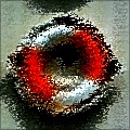 Math meets art meets psychedelia. |
|
| Posted: September 23, 2015 1:32 pm | ||
|
Rachel Duim
|
Interesting filter. I feel it's a much better filter as a monochromatic effect, here is no saturation with high contrast:
 Math meets art meets psychedelia. |
|
| Posted: September 23, 2015 1:34 pm | ||
|
Rachel Duim
|
Also works well at low saturation, like a 2 or 3 tone:
 Math meets art meets psychedelia. |
|
| Posted: September 23, 2015 1:43 pm | ||
|
Rachel Duim
|
I like this filter. I have a couple of critiques.
First of all, the presets don't give a good example of the use of the controls within the filter, especially with color. All the presets are over saturated. You have a Saturation & Hue control, show their use. Controls seem to have overlapping function. Color Variation (bad name) and Saturation do the same things in different parts of the filter. Just confusing to me. To have less controls, things like Brightness can probably go. I never had to use it when I tested. The Anti rotation controls can be removed and tied to the main rotation controls. You could add a checkbox to tweak the anti-rotation. As I pointed out in my previous posts, the emphasis on high saturation hides what I feel is an excellent effect. I would change my saturation defaults to a much lower value. This is just my opinion, but the over-saturation just looks "cheesy". I blame Skybase for this... I like this filter a lot, take my criticism with a grain of salt. Math meets art meets psychedelia. |
|
| Posted: September 23, 2015 2:26 pm | ||
Skybase
 |
lol man... don't blame me for your own thoughts. I began leaving critiques because nobody else talks about other people's filters other than it being "great." To be honest, of course those comments are still nice, but it only goes so far. I know I say a lot and sometimes I feel I kinda said a bit too much, given in most cases people are just doing these for fun. But I think knowing what others are thinking about is helpful in producing art, especially in this case little programs in which we call Filters. The difference being there's an end user to these products. But either way, I do agree with what's being said above.
I think the filter is unique, I think it's in Ramlyn style, I think it'd need a couple more tweaks as stated above. |
|
| Posted: September 23, 2015 9:25 pm | ||
|
SpaceRay
|
WOW, this is very creative, artistic and unique, and like it, but as said well, the presets really does not show really what it can be done, and have all exactly same exactly over saturated red, with the same lifesaver, as surely this has a greater and higher potential.
i agree that constructive critics to help make it better is good and useful to make it better, as it is a filter to be used by lots of people You are really a talented, creative and great filter creator, good work |
|
| Posted: September 23, 2015 11:36 pm | ||
Ramlyn
 |
Ha! Ha! Thanks to everybody!!
Thanks so much for the good suggestions. I'll change it and make a new version. |
|
| Posted: September 24, 2015 1:27 am | ||
|
Ramlyn
|
To Rick Duim :
True, the "Color Variation" control is not much useful. I already thought to delete it. "Brightness" is not exactly useless, but thinking to reduce the controls, it can be deleted. Your low saturation and monochromatic examples are very good. When I made the presets, I didn't think to try monochromatic ones. I surely need to add them. About the Rotation / Anti Rotation controls.... I must see how to set it. |
|
| Posted: September 24, 2015 1:49 am | ||
|
Ramlyn
|
An update is arriving :
- Deleted "Color Variation" and "Brightness" - Changed the presets ( but I may still change some when I have more time ). - I kept the Rotation / AntiRotation system. |
|
| Posted: September 24, 2015 3:45 pm | ||
|
Ramlyn
|
The new update seems to be too different from the original and FF doesn't accept it.
So I will have to change it again. |
|
| Posted: September 25, 2015 4:23 am | ||
|
Ramlyn
|
The new update, less different from the original than the previous one, have been accepted.
In this update I deleted the whole "Color Variation" area ( 3 components + 2 controls ) and changed the saturation of 4 presets. |
|
| Posted: September 25, 2015 5:49 am | ||
|
Rachel Duim
|
I like the changes, but I could not help myself and changed a bunch of things, which you can use or disregard:
1) Ganged rotation controls 2) Reduced output controls (added gamma, removed brightness, contrast) 3) Tweaked the presets It's now down to 11 controls. I feel it works pretty much the same as before. It just seemed easier to show you what I had in mind, pardon my code Artistic _ Directional Scratches - reduced test.ffxml Math meets art meets psychedelia. |
|
| Posted: September 25, 2015 3:07 pm | ||
|
Ramlyn
|
Ha! Ha! Thank you for spending time working on it and posting it! I appreciate.
|
|
| Posted: September 25, 2015 3:22 pm | ||
|
Rachel Duim
|
This worked out well, here is Skyset, using the "reduced test" version of your filter:
 Math meets art meets psychedelia. |
|
| Posted: September 25, 2015 10:53 pm | ||
|
Ramlyn
|
Yes, nice result.
Yesterday I uploaded a watercolor-style filter. I think I would like to make something in the middle between this filter and the new watercolor one, with soft but linear strokes. I'll try. Let's see if anything good comes up. |
|
| Posted: September 26, 2015 7:20 am | ||
Join Our Community!
Filter Forge has a thriving, vibrant, knowledgeable user community. Feel free to join us and have fun!
33,825 Registered Users
+12 new in 30 days!
153,741 Posts
+13 new in 30 days!
15,384 Topics
+5 new in 30 days!
Online Users Last 5 minutes:
32 unregistered users.
Recent Forum Posts:
- Ancient Free Packs!! by Shayne
2 days ago - Double Mosaic by Ramlyn by Ramlyn
July 9, 2026 - New awesome TEXT component FF 14 - How to get the most of it? by CFandM
July 8, 2026 - Variable Kaleidoscope by inujima by SpaceRay
July 6, 2026 - Question about Upgrading to newest version by GMM
July 6, 2026 - Guide on how to use texture maps PBR export with Filter Forge for 3D by SpaceRay
June 24, 2026 - PBR work flow...? by SpaceRay
June 24, 2026 - Chaos Fields by Ramlyn
June 21, 2026 - Unleashing creativity art with the help of filter forge 11 by EAdams
June 14, 2026 - FF 11 and FF 12 Studio animations that could maybe be done I think by CFandM
June 8, 2026 - BB - BubbleBlocks by Ramlyn by Ramlyn
June 2, 2026 - Dragon Distort II by Wolfgang Halder by Wolfgang Halder
June 1, 2026