|
Messages 1 - 45 of 48
First | Prev. | 1 2 | Next | Last |
|
Kraellin
|
Double Weft Weave by ronviers
http://www.filterforge.com/filters/7249.html 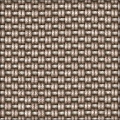 If wishes were horses... there'd be a whole lot of horse crap to clean up!
Craig |
|||||
| Posted: April 27, 2009 12:34 pm | ||||||
|
Kraellin
|
this one is freakin cool! nice job, ron
If wishes were horses... there'd be a whole lot of horse crap to clean up!
Craig |
|||||
| Posted: April 27, 2009 12:35 pm | ||||||
ronviers
 |
Thanks Craig.
I have submitted an update that is the same in appearance and performance but has an additional style, which allows one of the strands to be reversed – checkbox labeled 'Style'. Here is how it compares. Pre-existing style:  @ronviers |
|||||
| Posted: April 27, 2009 12:51 pm | ||||||
|
ronviers
|
The update has posted.
Newly added style:  @ronviers |
|||||
| Posted: April 28, 2009 3:44 am | ||||||
|
Kraellin
|
very nice! thanks
If wishes were horses... there'd be a whole lot of horse crap to clean up!
Craig |
|||||
| Posted: April 28, 2009 2:47 pm | ||||||
|
Kraellin
|
you know, ron, i think i'm going to quit downloading your filters until at least the sixth update on each.
If wishes were horses... there'd be a whole lot of horse crap to clean up!
Craig |
|||||
| Posted: April 29, 2009 7:42 pm | ||||||
|
ronviers
|
I know. I already have another update for this one but it is only a slight improvement and it does not address the basic issue that I keep getting ugly numbers. I developed a system using thresholds to align the blend profile curves, so I know how to set it to where it *should* be, but when I do, it looks bad. I would rather it look good than be correct but I would really like to reconcile the differences. I'm tempted to peek and see how Constantine does it, but I'm *sure* I can work it out for myself. If it didn't look as good as it does I would pull it until I get it fixed, but for now I am just going to leave it and not post anymore updates until I nail it. Sorry to everyone for the inconvenience. @ronviers |
|||||
| Posted: April 29, 2009 7:55 pm | ||||||
|
StevieJ
|
I don't think so.....I think it shows that you care and want to perfect your work.....and I like that quality in people..... Steve
"Buzzards gotta eat...same as worms..." - Clint :) |
|||||
| Posted: April 29, 2009 8:12 pm | ||||||
|
ronviers
|
Well thanks StevieJ. That's definitely putting it in the best light.
Don't worry Craig, I will not let this turn in to another YinYang fiasco. Actually, I feel bad about YinYang, but I learned so much from trying to make that filter that I would do it all over again. 
@ronviers |
|||||
| Posted: April 29, 2009 8:31 pm | ||||||
|
Kraellin
|
hehe, it's fine, ron. i love your filters. just teasin mostly due to how many updates there were with yin-yang and if ya did 20 more it wouldnt bother me, but i'd still tease ya
If wishes were horses... there'd be a whole lot of horse crap to clean up!
Craig |
|||||
| Posted: April 30, 2009 1:45 pm | ||||||
|
ronviers
|
Yeah, I really had it coming. In fact, I have requested that the yinyang filter be removed from the gallery. I will re-submit it once I have time to really nail it down. I am going to leave this one because even after I get it fixed, it will look just about the same. I really appreciate you taking the time to provide feedback on my work. @ronviers |
|||||
| Posted: April 30, 2009 1:52 pm | ||||||
|
Kraellin
|
what is it you feel still needs work on yin-yang?
and, you're welcome If wishes were horses... there'd be a whole lot of horse crap to clean up!
Craig |
|||||
| Posted: April 30, 2009 2:06 pm | ||||||
|
ronviers
|
The profiles on the bevels are ugly and not controllable by the user(other than width). IMO, if the user does not get control over the bevels, then I need to provide a really pretty bevel, and gaussian just does not do it for me.
@ronviers |
|||||
| Posted: April 30, 2009 2:13 pm | ||||||
|
ronviers
|
Do you think 'Double Weft Weave' is a good name for this filter? The new style option I added, where one of the strands is reversed, does not look like two weft strands (it looks more one strand that is twice as thick) - and I would like to keep that second option. Can you think of a better name?
@ronviers |
|||||
| Posted: April 30, 2009 2:17 pm | ||||||
|
ronviers
|
I just found this on wiki:
"The warp threads run lengthways of the piece of cloth, and the weft runs across from side to side." So I guess this would be considered a double warp weave. @ronviers |
|||||
| Posted: April 30, 2009 2:33 pm | ||||||
|
StevieJ
|
My friends call me "Steve".....
I've already accepted that I will never get it right the first time..... Steve
"Buzzards gotta eat...same as worms..." - Clint :) |
|||||
| Posted: April 30, 2009 8:03 pm | ||||||
|
ronviers
|
Me either, at least not in this lifetime. @ronviers |
|||||
| Posted: April 30, 2009 8:08 pm | ||||||
|
ronviers
|
But I also know for a fact how reluctant you are for people to see your unfinished work too. Remember the project you never let me see? Btw, how cool is this filter? oddButFun.ffxml @ronviers |
|||||
| Posted: April 30, 2009 8:13 pm | ||||||
|
Kraellin
|
i think i originally learned that as woof and warp, but i might have learned it wrong
and i played around with your 'oddbutfun'. pretty cool oddButFun rev 1 Krae.ffxml If wishes were horses... there'd be a whole lot of horse crap to clean up!
Craig |
|||||
| Posted: April 30, 2009 9:30 pm | ||||||
|
ronviers
|
Kraellin wrote:
i seriously doubt if i were to advise you to leave the damn thing alone, name and all, that you'd take that advice[/quote] When I first look at it, it looks fine. But if I just stare and stare at it, then it starts looking like crap. Wiki mentions woof as an older alternative to weft, but I had never heard that.
Something relaxing about it. That is an unusual mod. I never thought of using kaleidoscope that way. Never really ventured into kaleidoscope at all. Too difficult to control. @ronviers |
|||||
| Posted: April 30, 2009 9:59 pm | ||||||
|
Kraellin
|
well, as the doctor told the guy who said 'it hurts when i do this'... quit doing that! yes, kaleids tend to be shunned a bit around here. lol. and i think i'd change the way i did that one, if i were doing it again. but, i did like the idea of adding depth by making that a surface type. it's got a bit of an engineering feel to it on some of those presets or maybe of those 'connext' building blocks. If wishes were horses... there'd be a whole lot of horse crap to clean up!
Craig |
|||||
| Posted: May 1, 2009 8:20 am | ||||||
|
Kraellin
|
i had to have another play. i cleaned this one up a bit (as opposed to my last one) and changed things around quite a bit. i didnt add back any controls, as i have to go to work now, but i like having found the stars bit
oddButFun rev 1b Krae.ffxml If wishes were horses... there'd be a whole lot of horse crap to clean up!
Craig |
|||||
| Posted: May 1, 2009 8:45 am | ||||||
|
ronviers
|
Cool.
@ronviers |
|||||
| Posted: May 1, 2009 3:15 pm | ||||||
|
Kraellin
|
yep. they are in pretty much a fixed position, along with the little dot things. still, it was kinda cool finding them
 If wishes were horses... there'd be a whole lot of horse crap to clean up!
Craig |
|||||
| Posted: May 1, 2009 3:33 pm | ||||||
|
ronviers
|
Here is one with a little more depth.
 @ronviers |
|||||
| Posted: May 1, 2009 3:36 pm | ||||||
|
ronviers
|
||||||
| Posted: May 1, 2009 3:40 pm | ||||||
|
Kraellin
|
good change! that shows it up better
If wishes were horses... there'd be a whole lot of horse crap to clean up!
Craig |
|||||
| Posted: May 1, 2009 4:11 pm | ||||||
|
ronviers
|
I am working on a very interesting modeling project right now but I would like to come back to it when I get some time. I have tried to get a winner in the pattern category but both of my previous tries went LU.
@ronviers |
|||||
| Posted: May 1, 2009 4:19 pm | ||||||
|
Kraellin
|
pattern types seem to be one of the hardest to get HU's in. i got one or two, but that was when there werent 6000+ filters, too. it can be done, though. just find a pattern that is highly recognizable, like my childreen's wallpaper one was. i think that may be the key; something folks can recognize and have some familiarity with.
If wishes were horses... there'd be a whole lot of horse crap to clean up!
Craig |
|||||
| Posted: May 1, 2009 4:37 pm | ||||||
|
ronviers
|
Are either of you still using CRT monitors?
@ronviers |
|||||
| Posted: May 3, 2009 7:45 pm | ||||||
|
ronviers
|
How many of the blacks can you make out?
@ronviers |
|||||
| Posted: May 3, 2009 7:56 pm | ||||||
|
ronviers
|
If I drag the step wedge to my CRT I can only see eleven. I can see all fifteen on the LCD.
@ronviers |
|||||
| Posted: May 3, 2009 7:58 pm | ||||||
|
Kraellin
|
i have a crt on my win 98 machine, but my crt on the xp machine just burned out and i now have a 22 inch lcd. and yes, i can see all of those marks. the lcd came with a calibration chart.
If wishes were horses... there'd be a whole lot of horse crap to clean up!
Craig |
|||||
| Posted: May 3, 2009 8:01 pm | ||||||
|
ronviers
|
How many ff users do you think still use the CRT? Could you have made out all the marks on your CRT?
@ronviers |
|||||
| Posted: May 3, 2009 8:03 pm | ||||||
|
Kraellin
|
i've no idea how many have crt's, but i do know they are very cheap, for a larger size and very nice picture with more internal tweaks. i was pleasantly surprised.
as for the marks on my crt, mostly, yes, though admitedly those ones on the far right and left were pretty tough to be sure i was really seeing any diff. that's another thing that impressed me on the lcd; i had no problem making them out on that. If wishes were horses... there'd be a whole lot of horse crap to clean up!
Craig |
|||||
| Posted: May 3, 2009 8:08 pm | ||||||
|
ronviers
|
I think there is a tendency for people to operate their LCD monitors too bright. They come from the factory set very bright and I am not sure most people turn them down.
I guess I should make my presets with the assumption that they will be viewed on a correctly configured LCD, but I am not sure that is valid.  @ronviers |
|||||
| Posted: May 3, 2009 8:13 pm | ||||||
|
ronviers
|
I just noticed that there are sixteen steps but I did not notice white.
@ronviers |
|||||
| Posted: May 3, 2009 8:15 pm | ||||||
|
Kraellin
|
lcd's are a bit of a problem in their display being that the angle one views them at is so critical to a proper display. that was one of the reasons i was so hesitant in buying one. the quality has gotten better, but i have to be somewhat careful how i angle my monitor when working or i end up being off a bit. still, i doubt i'll go back to a crt; the extra dynamic range is worth it and the size per dollar cost is quite a bit nicer than crt's. plus, retailers just arent carrying crt's any more around here. cant even find one.
i dont know about too bright. mine did seem bright at first, but on doing the software calibration, it seems fine now. 16 huh. hmm, so it would seem If wishes were horses... there'd be a whole lot of horse crap to clean up!
Craig |
|||||
| Posted: May 3, 2009 9:10 pm | ||||||
|
ronviers
|
I have one of the cheapest LCDs on the market, an LG 1440x900. It does ok when viewed straight on, and even handles some right to left shifting, but if I raise or lower my head even a few inches then the picture quality nosedives - it acts as a reminder to keep my back straight.
One of the things I like best about it is its weight. It replaced a CRT that must have weighed 30+ lbs. I'm not going back to CRT either but I hope the LCD's will someday have better blacks and saturation. @ronviers |
|||||
| Posted: May 3, 2009 9:21 pm | ||||||
|
Kraellin
|
yes, the weight is much less. i like that also. i wasnt real keen on the 16:9 widescreen format, at first, but i'm used to it and even enjoy it now.
i've also noticed the blacks problem. sometimes my blacks look a bit green, though for the most part, that only seems to occur when i'm viewing a lot of text and even then i'm not sure if it's not eye strain the one thing i have noticed that is a bit disturbing, is that my crt seemed to do better matching up to my printer colors. i think this is one of those things about the brightness you mentioned with lcd's. now, i expect my prints to be a bit darker than the monitor representations. that's just normal, but it's a bigger disparity now with the lcd and even shows a bit of hue differentiation, which i never had with the crt and this printer. the hues comes out generally a darker shade. so, if i had a bright green-yellow on my monitor, the print might come out a green-green and a darker shade. it's not by much and the text here makes it seem more exaggerated than it really is. it's really not far off, but where i was REALLY pleased with this printer before, the lcd seems to not match up as well. ah well, maybe it's time to get a hardware calibrater and start using photoshop's gamut feature more. If wishes were horses... there'd be a whole lot of horse crap to clean up!
Craig |
|||||
| Posted: May 3, 2009 10:24 pm | ||||||
|
ronviers
|
I am not even close to spending money on that. I have a million other things I need to worry about. Some of the most disheartening questions I see on the forums are from experienced professionals that cannot get their color loop closed. So I am not going to waste my time trying. I adjust the gamma of the individual colors so that my grays stay neutral across the spectrum of black to white, and I set the black level, then call it good enough. This is a bad time for color management - guess it has been for a long time. The one company that could fix it, microsoft, seems disinterested. I was hoping that Vista would provide a path for everyone, but they seem incapable of using their dominance in constructive ways. It may have to come from a company like Apple or Canon - but even if they started now, it would take them years to get something pushed through the system. I guess we are a long way from it being easy. @ronviers |
|||||
| Posted: May 3, 2009 10:56 pm | ||||||
|
ronviers
|
It sure is taking ff a long time to remove this and my YinYang filters. I notice they appear not to be processing new filters either, maybe it's related.
@ronviers |
|||||
| Posted: May 3, 2009 10:58 pm | ||||||
|
ronviers
|
What does this remind you of? Think it could be anything?
 @ronviers |
|||||
| Posted: May 3, 2009 11:16 pm | ||||||
Betis
 |
Definitely OCD placed pebbles.
Roses are #FF0000
Violets are #0000FF All my base are belong to you. |
|||||
| Posted: May 3, 2009 11:28 pm | ||||||
|
ronviers
|
LOL
I never would have thought of that, but you're right - OCD placed and collected. and then there is this look:  @ronviers |
|||||
| Posted: May 3, 2009 11:37 pm | ||||||
Messages 1 - 45 of 48
First | Prev. | 1 2 | Next | Last
Join Our Community!
Filter Forge has a thriving, vibrant, knowledgeable user community. Feel free to join us and have fun!
33,825 Registered Users
+12 new in 30 days!
153,741 Posts
+13 new in 30 days!
15,384 Topics
+5 new in 30 days!
Online Users Last minute:
6 unregistered users.
Recent Forum Posts:
- Ancient Free Packs!! by Shayne
2 days ago - Double Mosaic by Ramlyn by Ramlyn
July 9, 2026 - New awesome TEXT component FF 14 - How to get the most of it? by CFandM
July 8, 2026 - Variable Kaleidoscope by inujima by SpaceRay
July 6, 2026 - Question about Upgrading to newest version by GMM
July 6, 2026 - Guide on how to use texture maps PBR export with Filter Forge for 3D by SpaceRay
June 24, 2026 - PBR work flow...? by SpaceRay
June 24, 2026 - Chaos Fields by Ramlyn
June 21, 2026 - Unleashing creativity art with the help of filter forge 11 by EAdams
June 14, 2026 - FF 11 and FF 12 Studio animations that could maybe be done I think by CFandM
June 8, 2026 - BB - BubbleBlocks by Ramlyn by Ramlyn
June 2, 2026 - Dragon Distort II by Wolfgang Halder by Wolfgang Halder
June 1, 2026