|
Sphinx.
|
||||
| Posted: August 25, 2010 3:26 am | ||||
|
Sphinx.
|
Uh scary! Those eyeballs look really good! I love the color choice!
|
|||
| Posted: August 25, 2010 3:26 am | ||||
Totte
 |
Sauron is watching us
Great filter! - I never expected the Spanish inquisition |
|||
| Posted: August 25, 2010 3:46 am | ||||
| Ruckage |
Thanks very much for the comments. I was definately more than a little inspired by Sauron when I made that preset
|
|||
| Posted: August 25, 2010 5:43 am | ||||
|
Sphinx.
|
I played with your filter - great stuff and the randomizer seem to work well (i.e. no extreme "wrong looking" renderings).
I noticed that the blood vessels looked a bit flat (like on a flat surface) compared to the shading and all, so I edited the filter and optimized it a bit (full rendering, before: 1 min, now 18 secs). Feel free to use it if you want. Eye Factory - Sphinx.ffxml |
|||
| Posted: August 25, 2010 7:08 am | ||||
ronviers
 |
Great job! Best use of the kscope I have seen yet.
@ronviers |
|||
| Posted: August 25, 2010 8:43 am | ||||
| Ruckage |
Thanks Sphinx, I had no idea how to achieve that sphere distort for the veins, definately adds to the look so I'll include it in an update. I'll add an option to enable or disable the sphere distort though as if you want to use the difuse map as a texture it wouldn't be needed. I did notice your changes have resulted in some loss in detail in the iris but I'll study your modifications some more and see if I can optimise the filter whilst retaining the detail. Still very much learning so this kind of feedback is very helpful, thanks again. |
|||
| Posted: August 25, 2010 10:18 am | ||||
|
Mike Blackney
|
The great eye is ever watchful
Nice work! |
|||
| Posted: August 25, 2010 8:28 pm | ||||
|
Indigo Ray
|
One of the best eye filters here!
|
|||
| Posted: August 26, 2010 7:23 pm | ||||
|
Carl
|
great look
|
|||
| Posted: August 26, 2010 7:24 pm | ||||
|
Kraellin
|
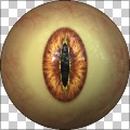
hehe, love the sauron references. something bugs me about the default. it's the depth perception between the iris/pupil and the eyeball. you've got a good gradient from the outer eyeball to the center, with the center highlighted quite strongly, but then you place a much darker iris/pupil in the middle and the difference/contrast between that and the eyeball highlight makes the iris/pupil look sunken or a bit concave around the iris.
now, on some of the others it's quite different. not sure how you could get around it with the variety you've got there. like, #2 the iris looks quite raised up, almost like another sphere on top of the eyeball. but, #1 and #3 look quite natural. tricky stuff. overall, though, quite a good filter! If wishes were horses... there'd be a whole lot of horse crap to clean up!
Craig |
|||
| Posted: August 26, 2010 11:50 pm | ||||
| Ruckage |
Hi Craig thanks for the feedback, I think I see what you mean.
I might have been trying to be too clever for my own good. What I tried to do was give the impression of a lens over the Iris as a real eye has bulge where the lens covers the Iris. You're right that in some instance it looks a bit off in my presets. I'm working on an update so I'll tweak the lens to try and get a better matchup and probably add a slider to reduce/increase that effect if needed. |
|||
| Posted: August 27, 2010 4:17 am | ||||
|
Kraellin
|
k. that sounds good. after all, who says the iris cant be raised or lowered?
If wishes were horses... there'd be a whole lot of horse crap to clean up!
Craig |
|||
| Posted: August 27, 2010 3:12 pm | ||||
| Sneath |
Wow! Great Filter. Thanks for sharing.
|
|||
| Posted: November 26, 2012 7:24 am | ||||
Join Our Community!
Filter Forge has a thriving, vibrant, knowledgeable user community. Feel free to join us and have fun!
33,825 Registered Users
+10 new in 30 days!
153,742 Posts
+14 new in 30 days!
15,384 Topics
+5 new in 30 days!
Online Users Last minute:
17 unregistered users.
Recent Forum Posts:
- Chaos Fields by Rachel Duim
yesterday - Ancient Free Packs!! by Shayne
July 15, 2026 - Double Mosaic by Ramlyn by Ramlyn
July 9, 2026 - New awesome TEXT component FF 14 - How to get the most of it? by CFandM
July 8, 2026 - Variable Kaleidoscope by inujima by SpaceRay
July 6, 2026 - Question about Upgrading to newest version by GMM
July 6, 2026 - Guide on how to use texture maps PBR export with Filter Forge for 3D by SpaceRay
June 24, 2026 - PBR work flow...? by SpaceRay
June 24, 2026 - Unleashing creativity art with the help of filter forge 11 by EAdams
June 14, 2026 - FF 11 and FF 12 Studio animations that could maybe be done I think by CFandM
June 8, 2026 - BB - BubbleBlocks by Ramlyn by Ramlyn
June 2, 2026 - Dragon Distort II by Wolfgang Halder by Wolfgang Halder
June 1, 2026