|
Boogie Jack
|
I tossed out my entire wish list except the following three items because I discovered some of my wish list items were there only I didn't know how to use them. It really is a "genius" level product. I'm addicted.
Having said that, here are three things I think would make it better:
1. Control to randomize colors only. For example, some filters have a ton of controls. You might like the design the "next variant" came up with, but not the color combination. While setting your own colors is usually an option, randomizing colors often produces some great combinations that you may never come up with on your own. Locking all the controls except the color inputs can be tedious. A simple "randomize colors only" is a simple, yet elegant, solution.
2. A way to label groups of controls and delineate the different groups. For example, a filter may have a base layer with five controls and an overlay layer with 7 controls. Rather that typing "Background Saturation", "Background Hue" and so forth, we could just have a grouping called "Background Layer" or whatever we needed. We'd be able to enter the text for the label group just like we enter text for control labels. Inserting a divider to separate the groups or having a box drawn around the group would be keen. That would also help eliminate the occasional problem of not having enough characters available to fully spell out a control name, as the grouping name could supplement the control name (example: Background Saturation" is one character too long for a control label, but "Saturation" in a group labeled "Background" would get the job done.)
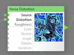
3. Please use a darker color for the unused control options in the filter editor (like the "distortion" and "roughness" control options on the noise distortion filter). The small, light gray text on white doesn't offer enough contrast to be easily read for those of us who don't have perfect vision (age does that to you). I often have to make a connection to be able to read the text. It's not only inconvenient for many of us, but it really is an unnecessary impediment, in my humble opinion.
Thanks for considering these items.
|
| Posted: November 20, 2019 8:57 pm |
Details
E-Mail
|
GMM
Moderator
Filter Forge, Inc
Posts: 3502
|
Thanks for your suggestions. If you have spare time please create a mock-up of the third option. What color combination would suit you better?
|
| Posted: November 21, 2019 4:37 am |
Details
E-Mail
|
|
Boogie Jack
|
Glad to help out. I've made two mock-up examples. I've also made mock-ups for the first two suggestions, just in case those options interests you as well. I'll put those in separate posts. Here's the mock-ups for item 3:
In this first image, simply making the unused options a darker gray would help a great deal. This image looks larger than the way it was made, but you can see how "Roughness" is easier to read than the options below it. I think this next way is even better:
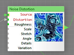
As you can see, the options being used are colored a dark red. The unused options are black. To my eyes, this is NICE! It's easy to read and shows the hot (used) options at a glance.
Thank you for considering this.
|
| Posted: November 21, 2019 8:28 am |
Details
E-Mail
|
|
Boogie Jack
|
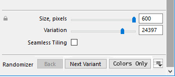
This post shows how the "randomize colors only" idea might look. Rather than a separate button as shown in the image, another good option would be to make randomizing colors another option in the drop-down menu where you can choose the level of randomization you want. That might not be as intuitive for new users, but it would work.
|
| Posted: November 21, 2019 8:33 am |
Details
E-Mail
|
|
Boogie Jack
|
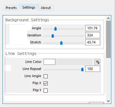
Lastly, here are two mock-ups for item two on my wish list showing how two ways of grouping controls might look:
That first one simply uses a heading and has a divider line drawn from the end of the heading to the end of the heading line. In looking it over now, I probably should have added a little extra space between the last control in one section and the heading for the next section. That would clean up the look and make it easier to visualize the groupings.
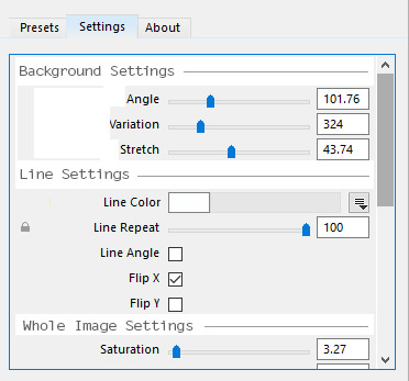
This second look groups controls in a box. I like this one the best as I think it's a cleaner look.
This is a modified screen shot of a filter I made. In the actual filter I had to label the first three controls as Background Angle, Background Variation, and Background Stretch. That's a whole lot of letters that make the controls look more cluttered. I left the second part as is in my filter, with the word "line" repeated for each line control. While that section doesn't look cluttered because "line" is a short word, it would still be nice to eliminate the unnecessary verbiage, in my opinion.
Once again, thanks for considering these suggestions.
|
| Posted: November 21, 2019 8:57 am |
Details
E-Mail
|
GMM
Moderator
Filter Forge, Inc
Posts: 3502
|
Thanks Boogie Jack. A visual aid is always helpful when considering to implement something.
|
| Posted: November 21, 2019 9:11 am |
Details
E-Mail
|
|
Boogie Jack
|
Thanks GMM, I'll try to remember to create a graphic (when applicable) for any future suggestions I may have.
|
| Posted: November 21, 2019 9:32 am |
Details
E-Mail
|