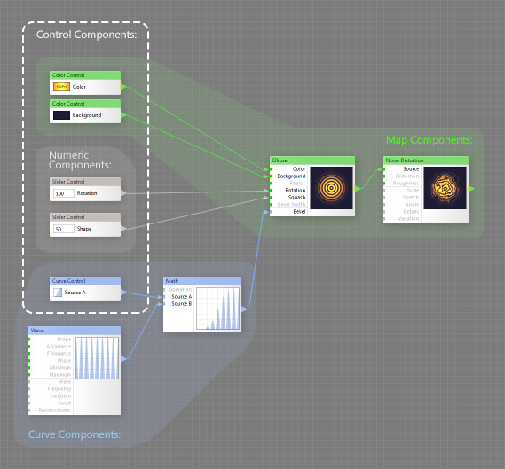
Control Components allow you to add controls such as sliders, curves and color swatches to the Settings tab in Filter Controls, providing the ability to manipulate the parameters of other components from outside the Filter Editor. Beside that, control components can define group inputs when placed inside a group. All control components can be found in the Controls category on the Components Bar:
- There are three types of control components: Map, Curve and Numeric.
- Map controls (namely, Color Control and Grayscale Control) add a color swatch to the Settings Tab, providing the ability to use a single color, a built-in image or load an external image from the hard drive.
- A Curve control adds an curve thumbnail to the Settings Tab. Clicking it will open the Curve Editor that allows you to fine-tune the curve shape.
- Numeric controls add a control that outputs numbers, such as Angle or Slider. Numeric controls may have Remappers allowing you to fine-tune the way they affect each of their target inputs.
- In order to appear in the list of controls, control components must be connected to the subtree of the Result component or to Result directly.
- Control components inside a group don't appear in the filter controls but define the group inputs, allowing you to place the group into the component tree.