The Checkbox Control component adds a checkbox control to the Settings tab in Filter Controls, providing the ability to manipulate the component parameters from outside the Filter Editor. When the user changes the Checkbox Control state on the Settings tab by checking or unchecking it, the target inputs change their values accordingly.
Checkbox Control is good for controlling any input, as long as you need only two target values – it assigns one of the two predefined values to the target input depending on the checkbox state (checked or unchecked).
Checkbox Control is a numeric control component, it can be located in the Controls category on the Components Bar. The controls added by Checkbox Control components appear on the Settings tab in Filter Controls. In order to appear in the list of controls, Checkbox Control must be connected to the subtree of the Result component or to Result directly. Like any numeric component, Checkbox Control can be connected to any input except the required ones (shown in red). The position of the control in the list can be customized in the Order of Controls dialog.
Name
Lets you specify the name under which the checkbox control will be displayed on the Settings tab in Filter Controls. By default, the control gets the name of the first input it is connected to. If the control is not connected to any component yet, it will be named 'Untitled' (shown in red).
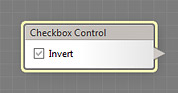
Checked
Defines the state of the checkbox (checked or unchecked) that goes to the target inputs. Depending on this state, each target input will receive one of the two predefined values. These values can be modified by Remappers – see Use Remapping below for details. When Use Remapping is turned off (or when the remapper is set to its default settings), the checkbox state is passed to the target inputs as follows:
- To Checkbox inputs: the state is passed to the target checkbox input unchanged.
- To Slider inputs: when the checkbox is checked, the target slider assumes its maximum value, when unchecked – its minimum value.
- To Color inputs: when the checkbox is checked, the target color becomes white, when unchecked – black.
- To Angle inputs: when the checkbox is checked, the target angle control assumes the value of 90 degrees, when unchecked – 0 degrees.
- To List inputs: when the checkbox is checked, the first item in the list is selected, when unchecked – the second item.
- To IntSlider inputs: when the checkbox is checked, the target integer slider assumes the value corresponding to 2/3 of its actual range, when unchecked – to 1/3 of its actual range. See the IntSlider component for more information on how its actual range is calculated.
- To Value inputs: when the checkbox is checked, the target value input assumes the value of 1, when unchecked – the value of 0.
Use Remapping
When turned on, enables Remappers for all connections of Checkbox Control to its target inputs. Remappers allow you to specify how Checkbox Control affects the resulting value of each target input. Depending on the type of the target input, remappers have different settings. For more info on Checkbox Control remappers, see the following sections:
Remapper (Checkbox Control to Angle)
Remapper (Checkbox Control to Checkbox)
Remapper (Checkbox Control to Color)
Remapper (Checkbox Control to HDR Color)
Remapper (Checkbox Control to IntSlider)
Remapper (Checkbox Control to List)
Remapper (Checkbox Control to Slider)
Remapper (Checkbox Control to Value)